

Payless is the largest family footwear retailer in the western hemisphere.

Contribution
I worked closely with the team on improving aesthetics, search, browse, customer service, engagement, ease of use, purchase confidence at checkout, and site responsiveness. Day-to-day included user stories, journeys, flows, empathy maps, wireframes, prototypes, brand standards, design sprints, and creative direction.
Role
Lead UXUI Designer
Problem
According to Honest Feedback and Analytics, users were struggling to find products, frustrated with an unresponsive site, and turned off by outdated branding. It was clear that we needed to update branding, and design a responsive website. But the most critical problem to solve was… How might we help shoppers find products?
Outcome
Sales increased by over 25%. Conversion and engagement also experience significant gains.
Methodologies
Design Sprint, Design Thinking, and Agile.
Full Case Study Real-World Application of Design Thinking

Basic Journey for user looking to buy rain boots

Wireframe for Landing Page

A Better Header
Our Hypothesis: We believe that improving the header will help shoppers find products faster and easier. We will know this is true when we see an increase in the use of the header and number of purchases. A reduction of clicks from header-to-purchase will also support our assumption.
We also conducted a heuristic evaluation of the header, studied competitors, best-in-class examples, and sketched plenty of flows and wireframes.

Brand Standards & Visual System
Users associate aesthetics with quality and ease of use. We made sure ALL visuals were up-to-date, attractive, and on-brand.

Promo Bar
Before our redesign, the link at header’s promo bar took users to a page with promo exclusions. What a wasted opportunity to improve experience and sell?! We added CTAs for all product categories. Instead of sending users to another page, we created a screen, to not interrupt their journey.
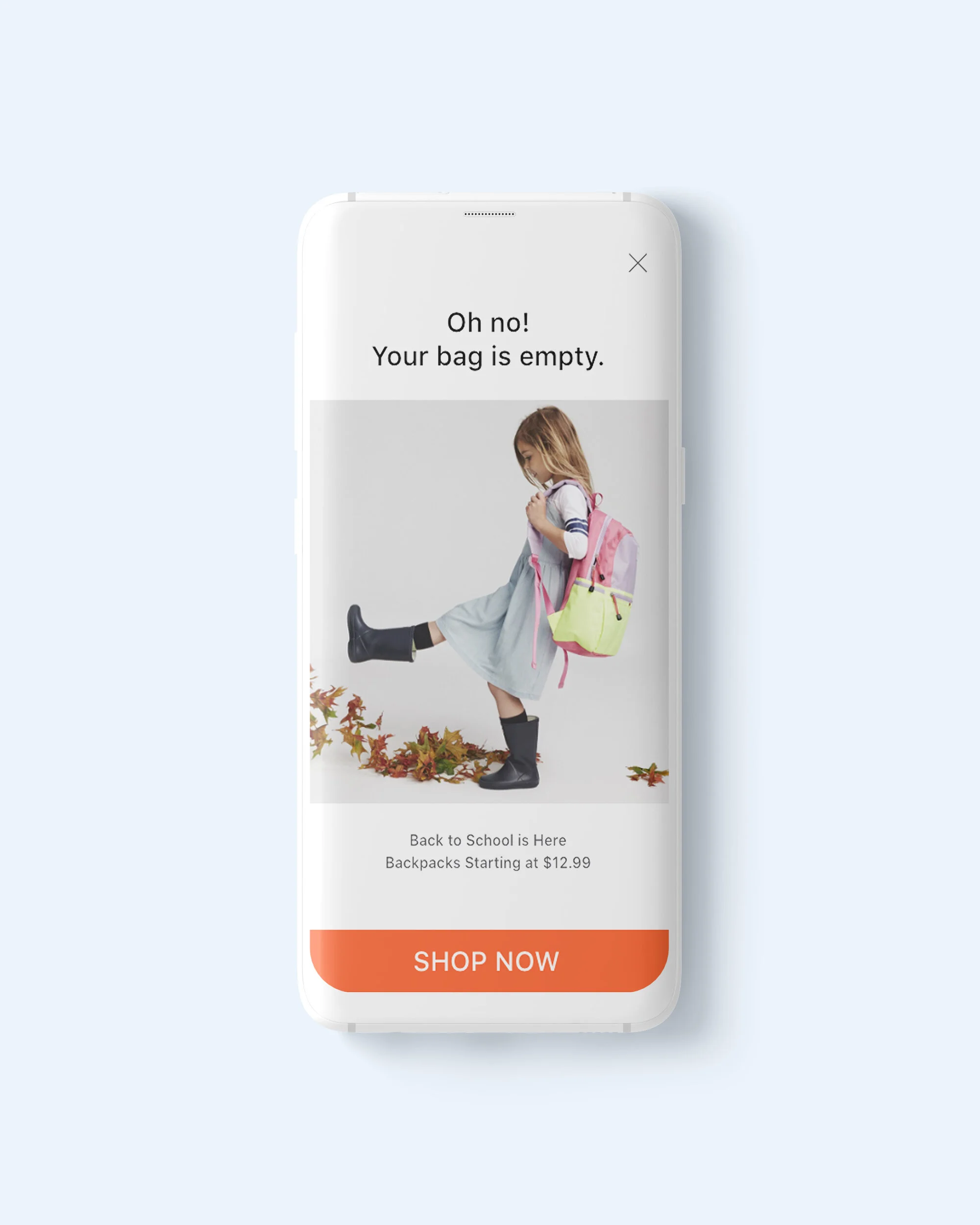
Empty Bag
Our redesign featured a personalized shopping experience. For example, checking an empty bag took users to the above screen with an offer based on their previous interactions.